South Shore Line
South Shore Line
South Shore Line
Transit Rebrand
Transit Rebrand
Transit Rebrand
Bridger Buchi
Role - UI Designer
Bridger Buchi
Role - UI Designer
Bridger Buchi
Role - UI Designer


Project Brief
Project Brief
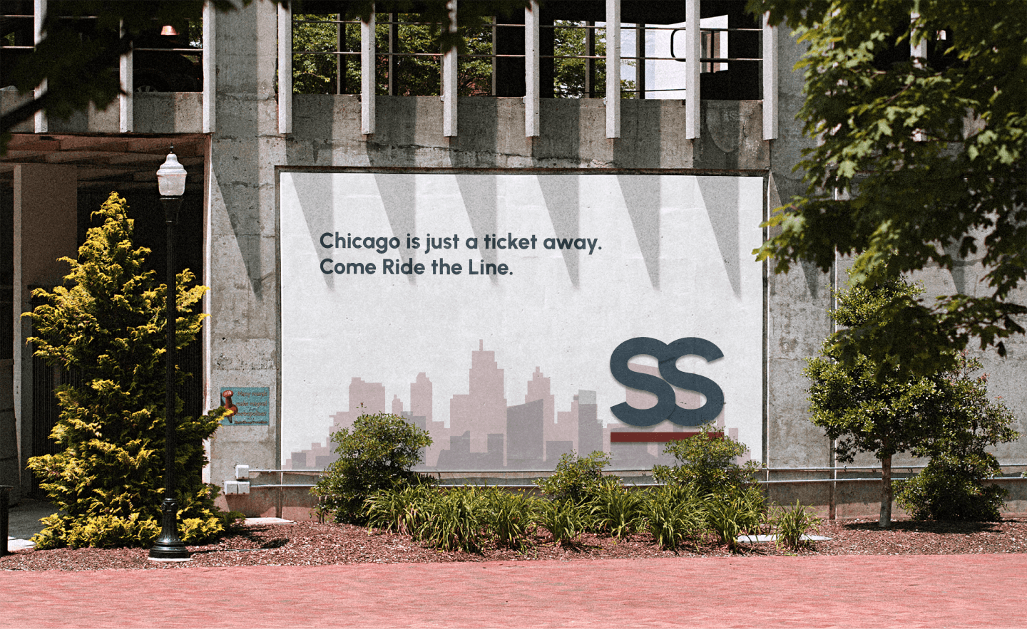
Project consisted of rebranding the mobile app for the South Shore Line Railway, a local transit which runs from South Bend, IN, to Chicago, IL.
Project consisted of rebranding the mobile app for the South Shore Line Railway, a local transit which runs from South Bend, IN, to Chicago, IL.
Project consisted of rebranding the mobile app for the South Shore Line Railway, a local transit which runs from South Bend, IN, to Chicago, IL.
Problem
Problem
Post researching this Chicago based transit, I discovered that the existing pain points resided in an unclear ticket purchasing process as well as an antiquated UI design, logo and aesthetic.
Post researching this Chicago based transit, I discovered that the existing pain points resided in an unclear ticket purchasing process as well as an antiquated UI design, logo and aesthetic.
Post researching this Chicago based transit, I discovered that the existing pain points resided in an unclear ticket purchasing process as well as an antiquated UI design, logo and aesthetic.


Solution
Solution
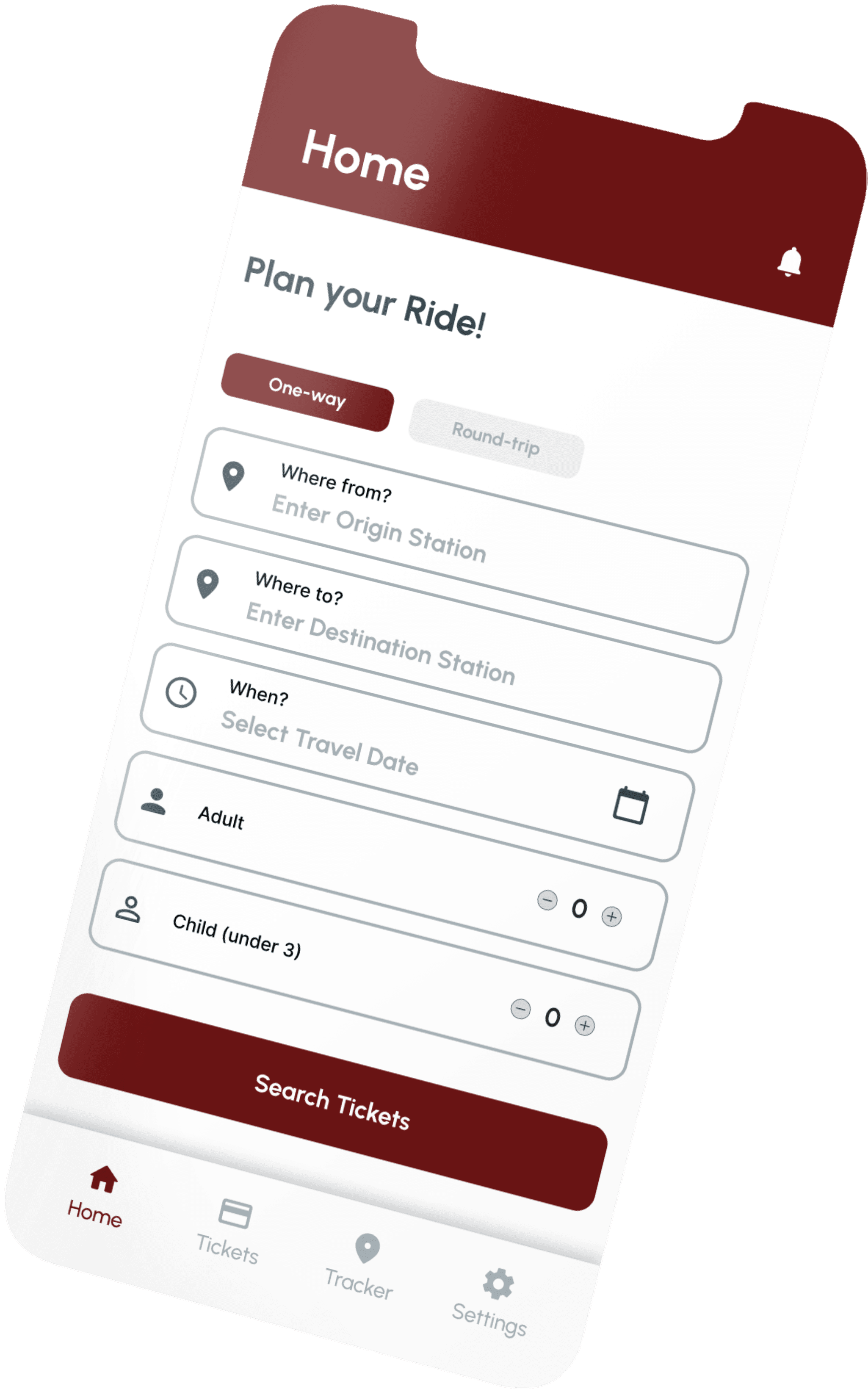
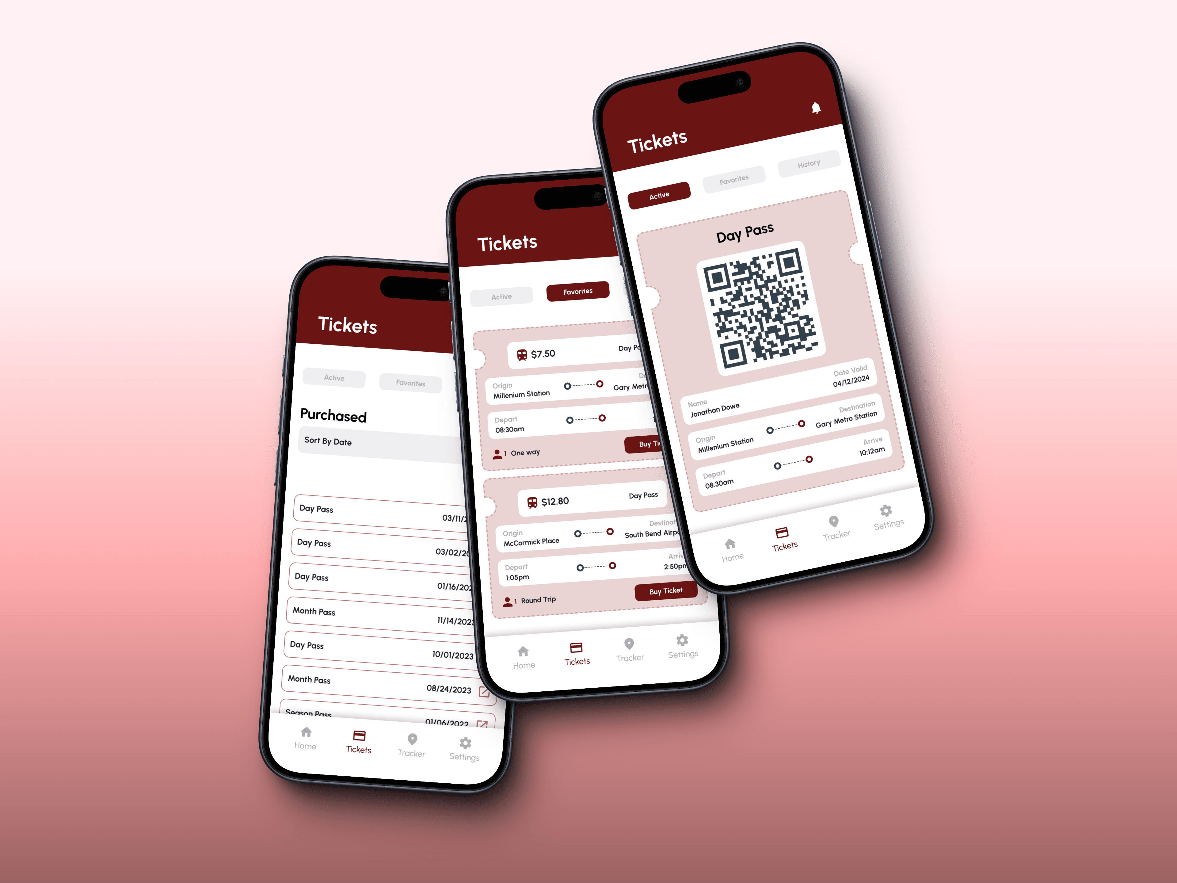
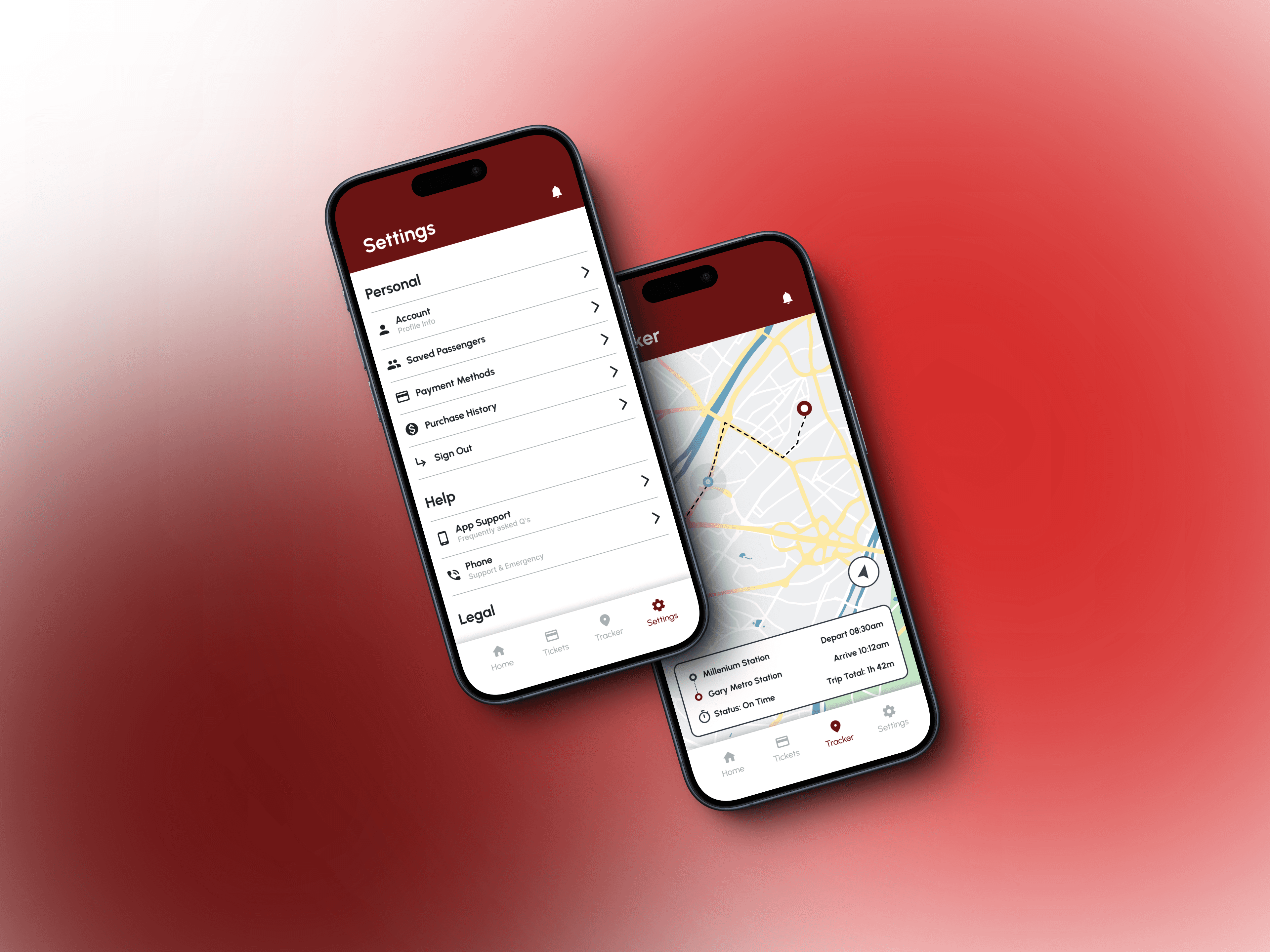
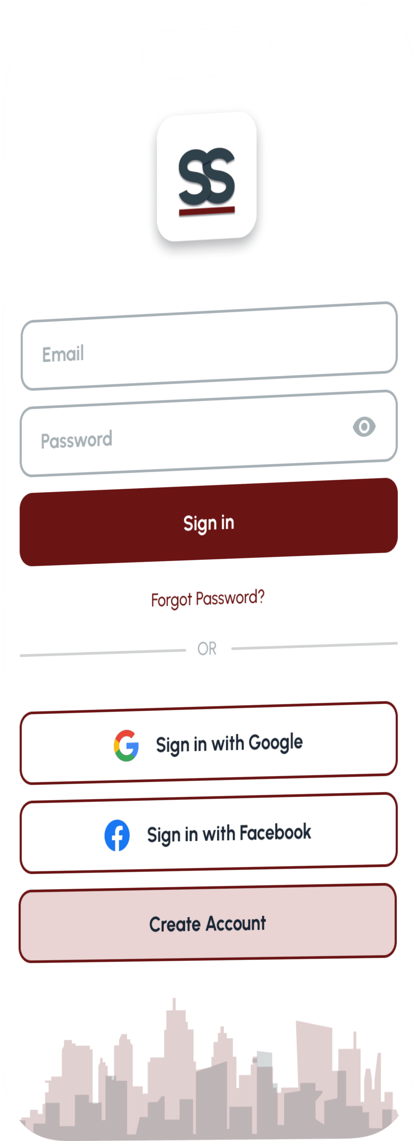
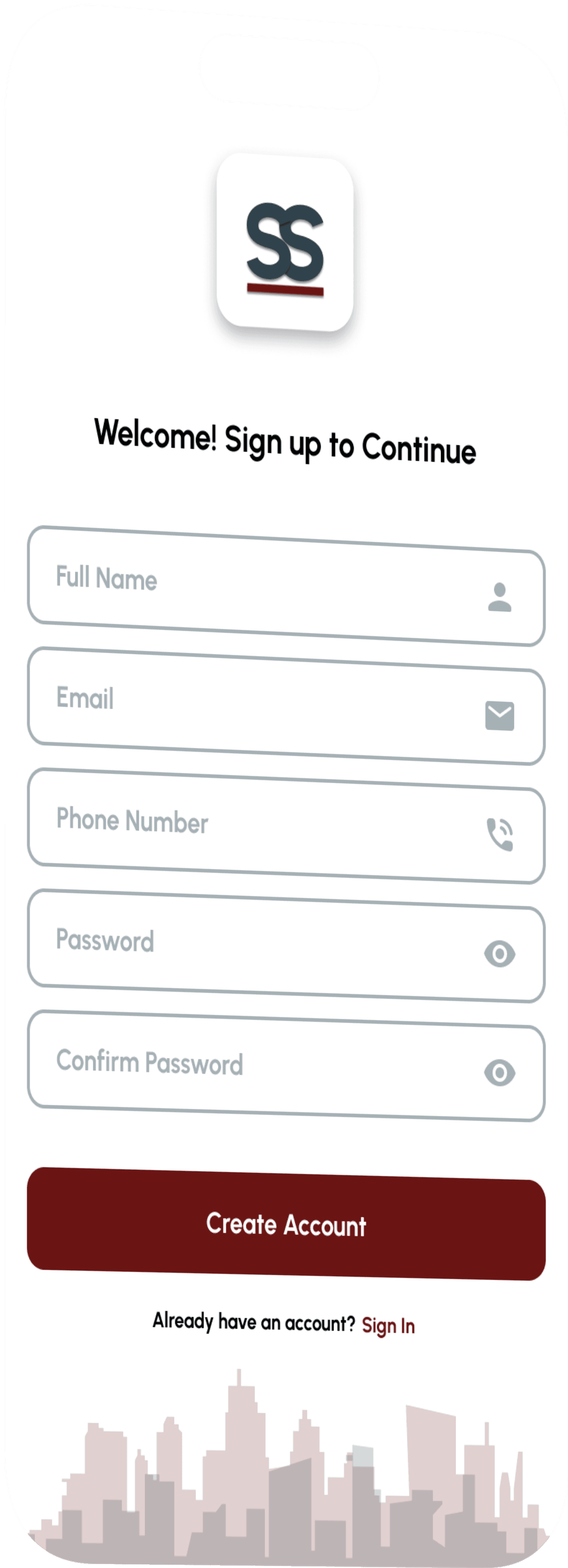
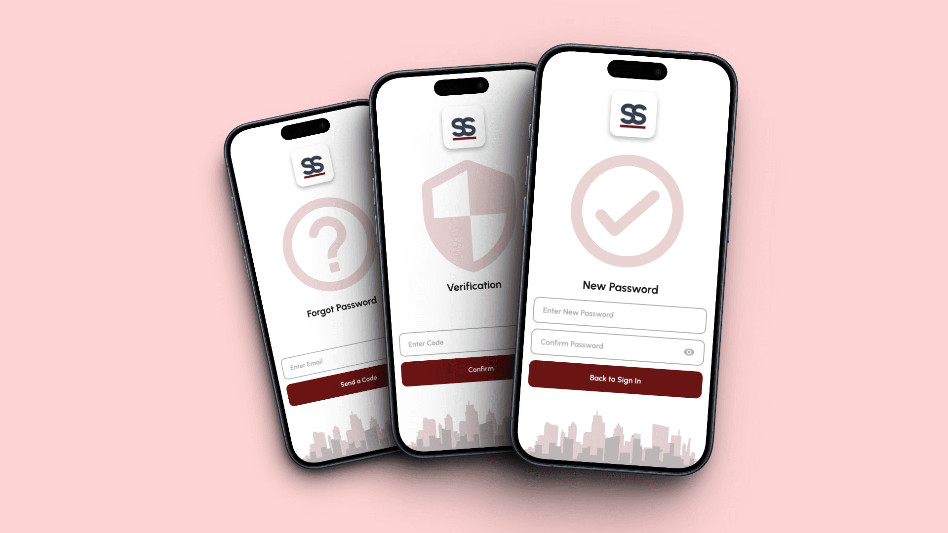
Modernize the South Shore Line App design and simplify the ticket purchasing experience.
Modernize the South Shore Line App design and simplify the ticket purchasing experience.
Modernize the South Shore Line App design and simplify the ticket purchasing experience.
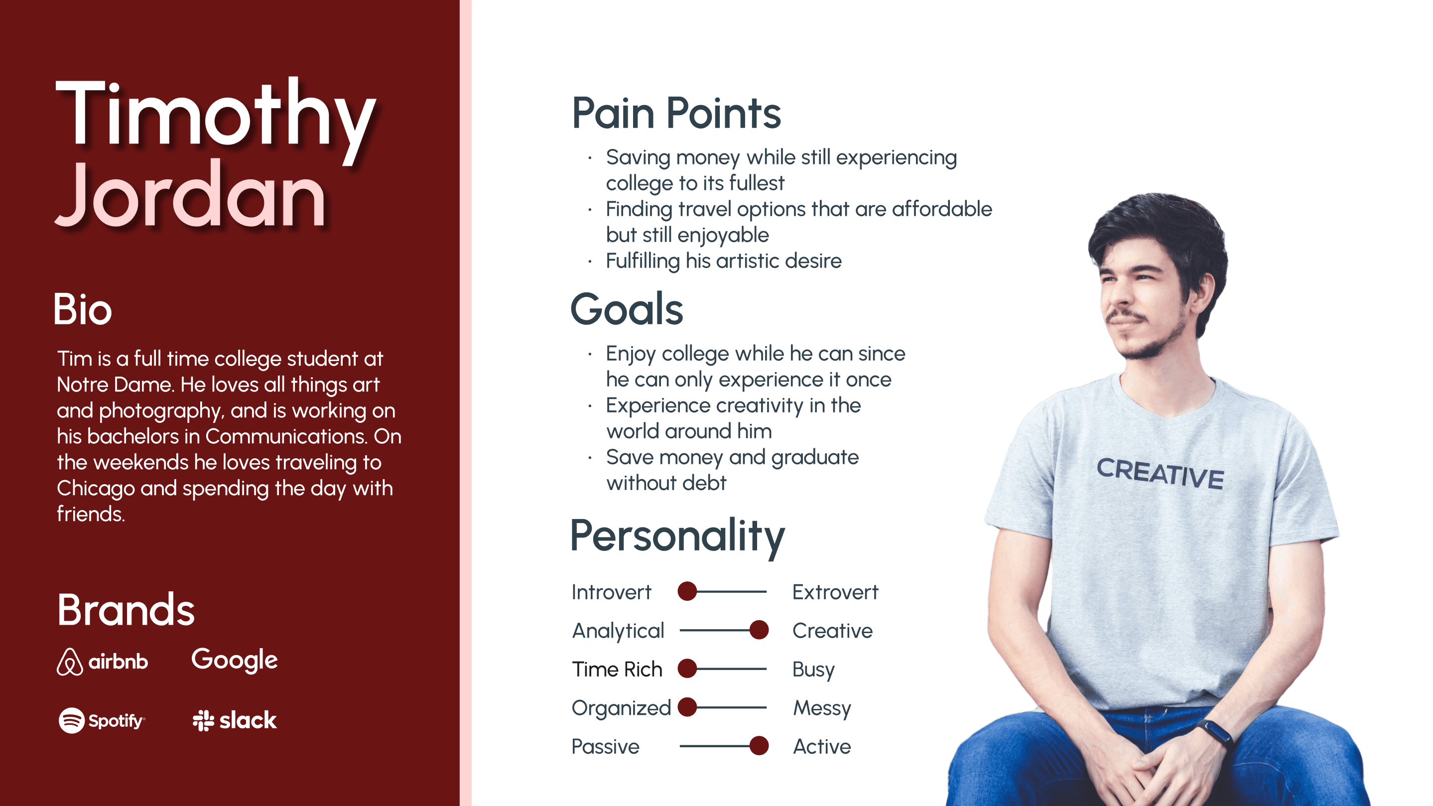
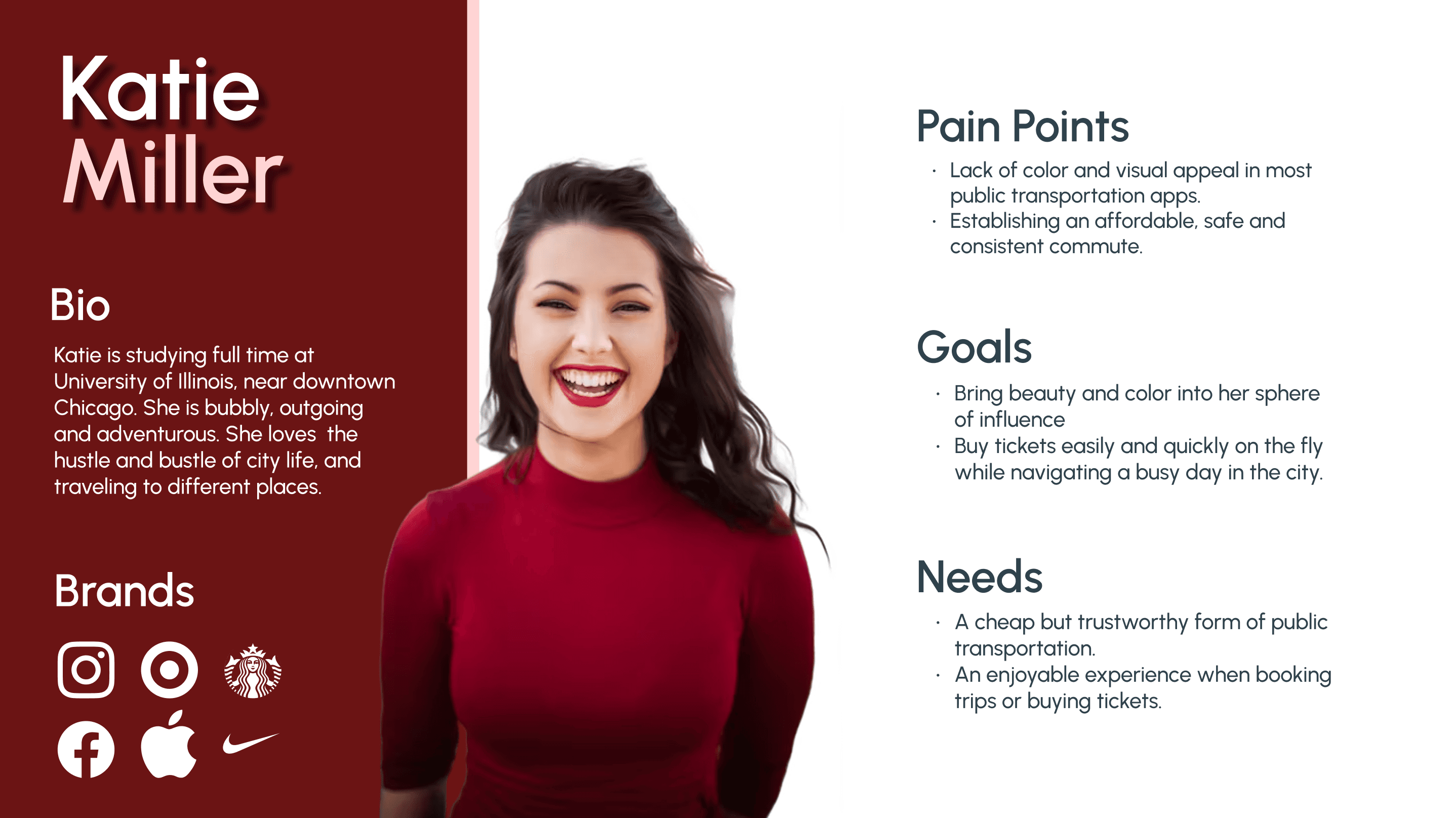
I knew from the beginning that getting to the heart of the problem would necessitate getting to the heart of my users.
I knew from the beginning that getting to the heart of the problem would necessitate getting to the heart of my users.
I knew from the beginning that getting to the heart of the problem would necessitate getting to the heart of my users.
Research
Research
Survey
78% of users did not like the app design
Interviews
60% of users struggled with ticket purchase
Competitor Analysis
App navigation for transits has to be quick
App Reviews
Most users expressed the app was outdated


Branding
Branding
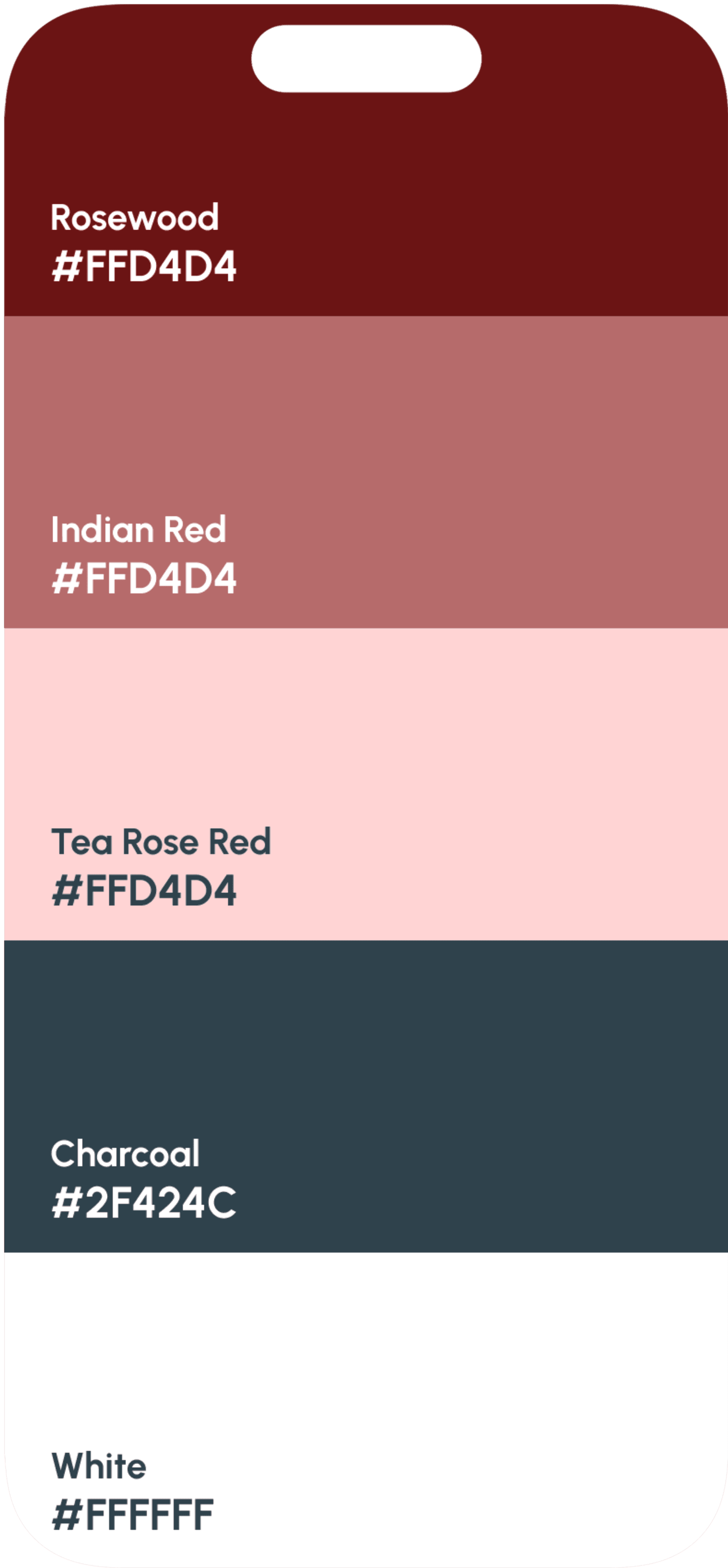
I wanted all branding elements to have ties to Chicago. Color palette was derived from base colors of the Chicago flag, while all other branding elements communicated a modern, urban vibe.
I wanted all branding elements to have ties to Chicago. Color palette was derived from base colors of the Chicago flag, while all other branding elements communicated a modern, urban vibe.
I wanted all branding elements to have ties to Chicago. Color palette was derived from base colors of the Chicago flag, while all other branding elements communicated a modern, urban vibe.

Urbanist
Urbanist
Aa Aa
Aa Aa
ABCDEFGHIJKLMNOPQRSTUVWXYZ
ABCDEFGHIJKLMNOPQRSTUVWXYZ
abcdefghijklmnopqrstuvwxyz
abcdefghijklmnopqrstuvwxyz
0123456789
0123456789
Urbanist
Urbanist
Urbanist
Urbanist
Urbanist
Urbanist
Urbanist
Urbanist
Urbanist
Urbanist
Urbanist
Urbanist
Site Map
Site Map
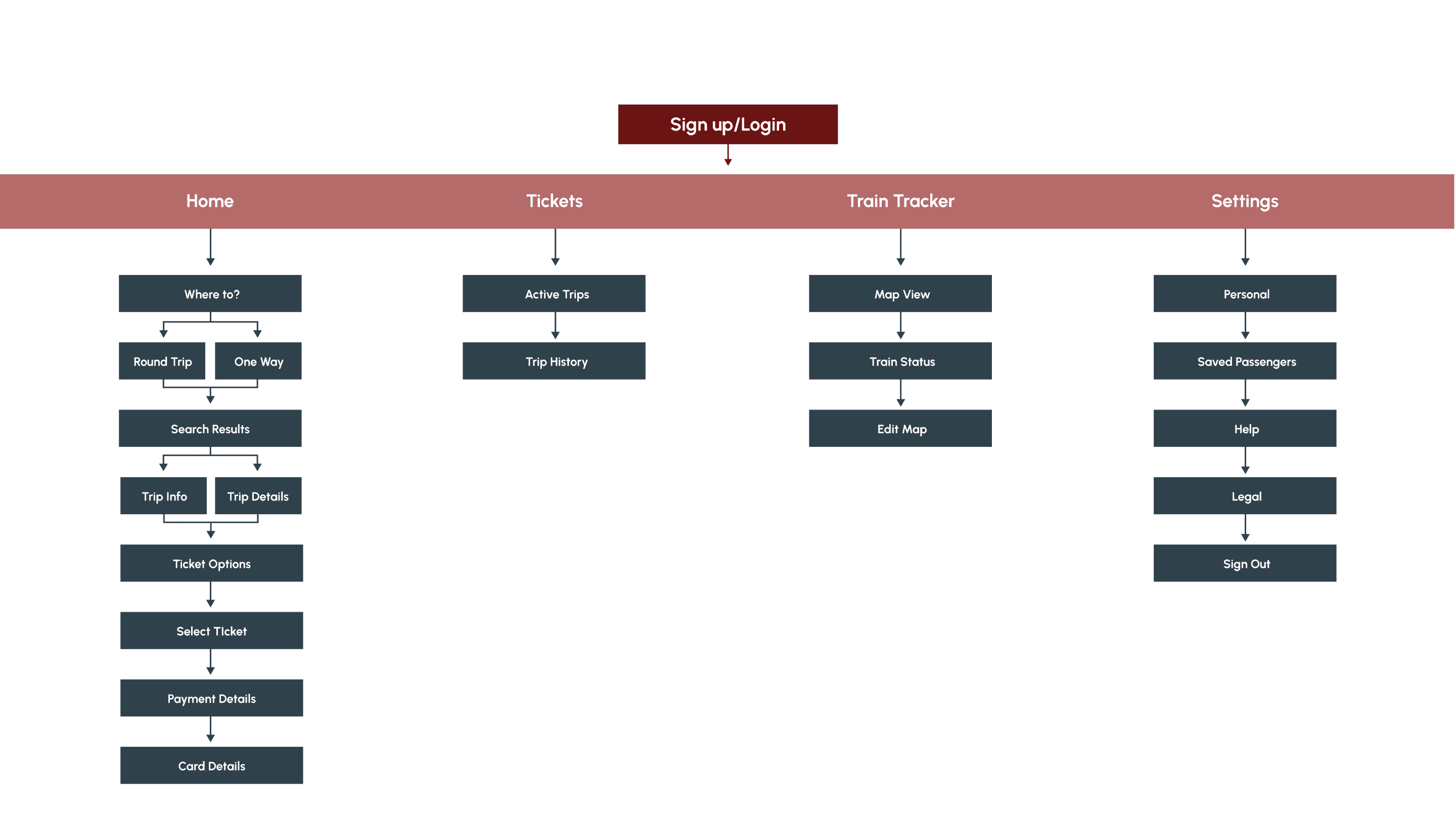
App navigation was simplified in order to expedite user flow, as well as eliminate displaying unnecessary information.
App navigation was simplified in order to expedite user flow, as well as eliminate displaying unnecessary information.
Site Map
App navigation was simplified in order to expedite user flow, as well as eliminate displaying unnecessary information.
